My Probate Partner
My probate partner is an online platform that makes the probate process in Scotland quicker and simpler.
My role
Content Designer (freelance)
Client goal
Increase sales
User pain points
Not understanding how to do probate or what support is available
Outcome
New content met user needs, and sales increased
The process
I wanted to understand the user needs and create content that met those needs. My process had four stages: discovery, preparation, design, and testing.
Discovery
The discovery stage involved:
desk research,
theming the data,
and identifying user needs.
Preparation
The preparation stage involved:
establishing user thinking styles,
writing job stories,
mapping user journeys,
and conducting a content audit.
Design
The design stage involved:
refining existing content,
designing new content,
documenting content patterns,
collaborating with subject matter experts,
prototyping in Figma,
improving accessibility and SEO,
and creating a style guide.
Testing
The testing stage involved:
adding on-page feedback forms,
and advocating for usability testing.
On this page
I’m highlighting four areas of work:
Discovery
When I began working on this project, I was told that no user research was available. This meant the team had no clarity about the needs of users. I began by doing desk research.
Desk research
By talking to stakeholders, I discovered that a spreadsheet existed that contained data on what users wanted to talk about when they booked a free call.
Theming the data
The spreadsheet had hundreds of lines of data. I themed the data by assigning labels. The top 5 themes were:
Find out more about the probate process
What services does MPP offer?
Can someone check my forms for me?
There is no Will
What forms do I need to fill in?
Identifying user needs
The themes revealed user needs.
Collaborative work to establish user thinking styles

Brainstorming touchpoints on the user journey

Grouping motivations that underlie the user needs

The process of defining user thinking styles

The thinking styles defined, with a description, summary, and sliders.
Job stories
After identifying the user needs, myself and another content designer wrote a set of 24 job stories with acceptance criteria. While reviewing these with stakeholders, some new job stories were also identified.
The job stories covered four phases of the user experience:
when someone has just died,
deciding how to do probate,
choosing a support package,
and managing probate.
Having a set of job stories meant that:
the need for new content became clearer,
the specific goals of each piece of content could easily be defined,
and content reviews became less subjective,
Each job story was given a number, so that it was easy to refer back to it.
Job story 001
When I find out I need to apply for Confirmation,
But I don't understand what that means,
I want to understand what the probate process actually is,
So I can feel confident that I know what I'm doing
Acceptance criteria:
This story is done when they can find a clear explanation of the probate process and the steps it involves.
Job story 007
When I am the named executor in a Will,
But I don't know where to start,
I want to find out what I need to do,
So I can understand what responsibilities I have
Acceptance criteria:
This story is done when they can find out what responsibilities an executor has.
We also wrote 19 key messages, to cover what users don’t know they need to know.
Design
In this portfolio, I’m sharing two areas of content that I designed:
product page,
contact pages.
While freelancing for My Probate Partner, I also designed help content.
User needs
Users wanted to easily find out what services My Probate Partner offered.
Protoype
Impact
I created a prototype of the services page in Figma.
The new page met the user need of finding out what services My Probate Partner offered. As a result, sales increased.
Contact pages
There are two types of contact pages on the site:
contact page,
and the book a free call page.
When I started on the project, these pages were identical. Which, as well as being confusing for users, isn’t good for SEO. I redesigned the pages so that they each have a distinct purpose.
Previous process
New design
User journey
Previously, users couldn’t easily find out what support packages were available or how much they cost. Instead, a user had to go through a ‘smart assessment’ where they answered a series of questions to find out if:
the Sheriff Court will help them for free,
they need to use a solicitor,
or if they can book an MPP probate support package.
To use the smart assessment tool, users had to know the value of the deceased person’s estate, and if the Will is valid in Scotland. Finding those things can be complicated and take a long time.
I designed a page which sits in the main navigation. On this page, users now have an overview of all the probate support packages that My Probate Partner offers. Users can now:
find details and prices of each package,
book a package,
or choose to use the smart assessment tool.
The new user journey becomes:
Trigger: someone dies.
Finding: find out I need to do probate in Scotland.
Doing: browse the probate support packages.
Getting: book the package I want.
Product page
My Probate Partner offers 4 probate support packages. But data showed that users weren’t clear about the support that My Probate Partner offered.
Revised pages: ‘Contact’ and ‘Book a call’
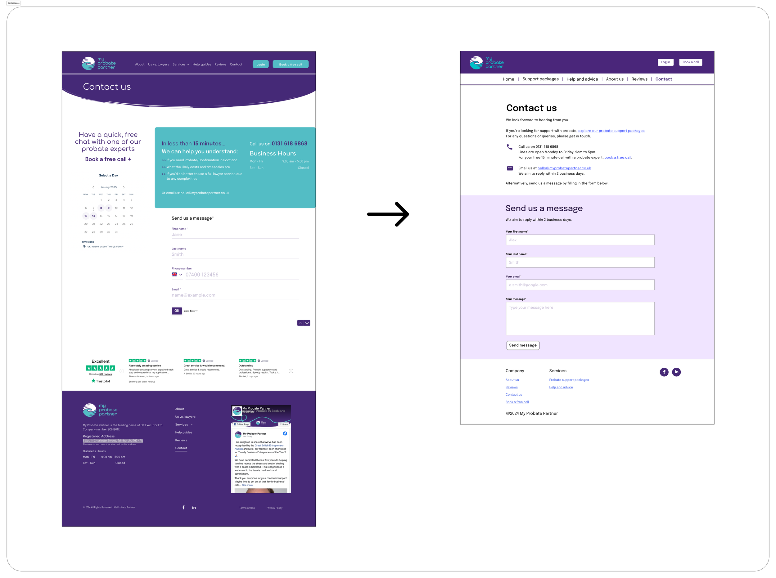
Contact us page
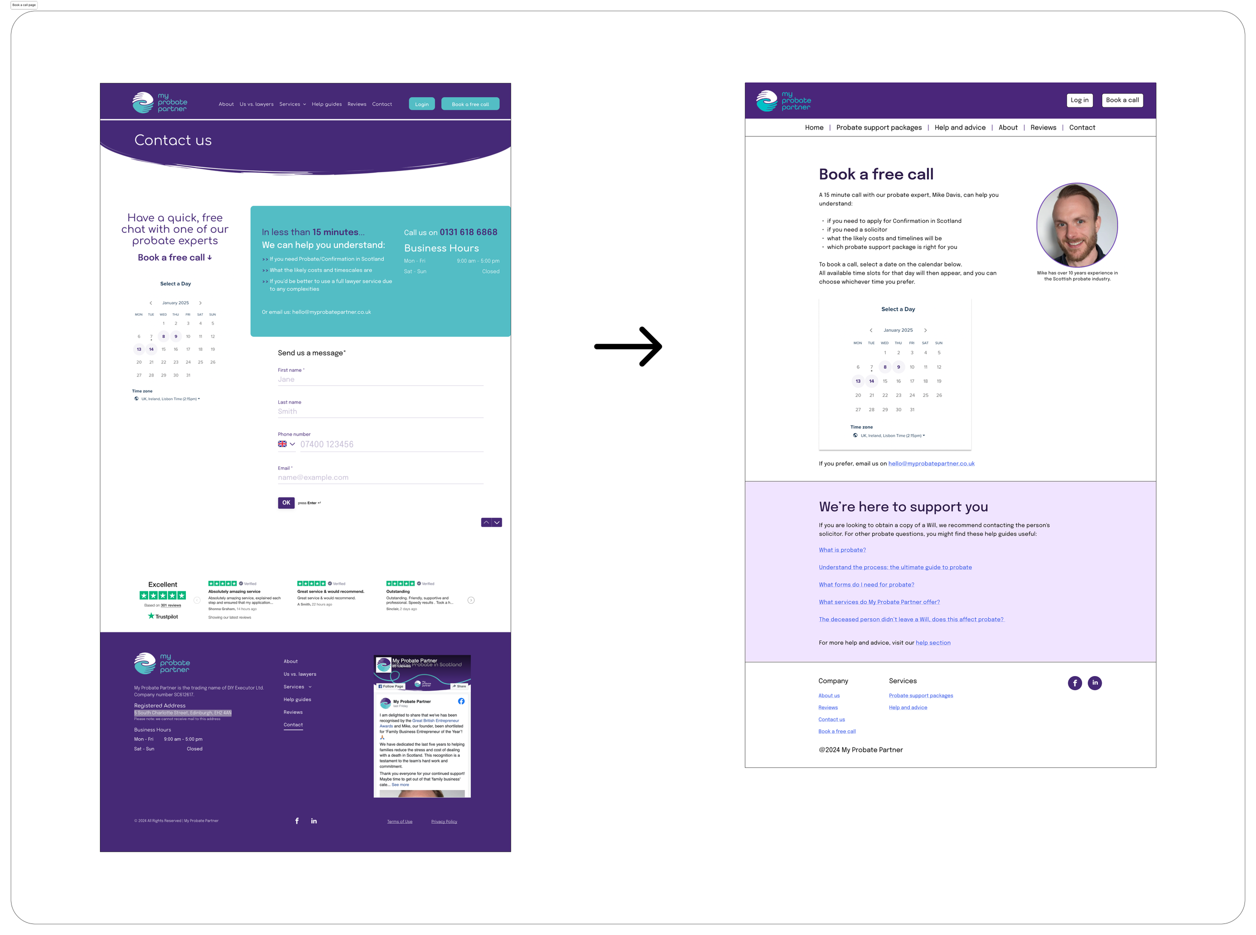
Book a call page
Accessibility
To improve accessibility, I suggested changes to:
typefaces,
line width,
contrast,
and the heading structure.
To help implement the changes across the site, I created a mini style guide in Figma.
Typefaces
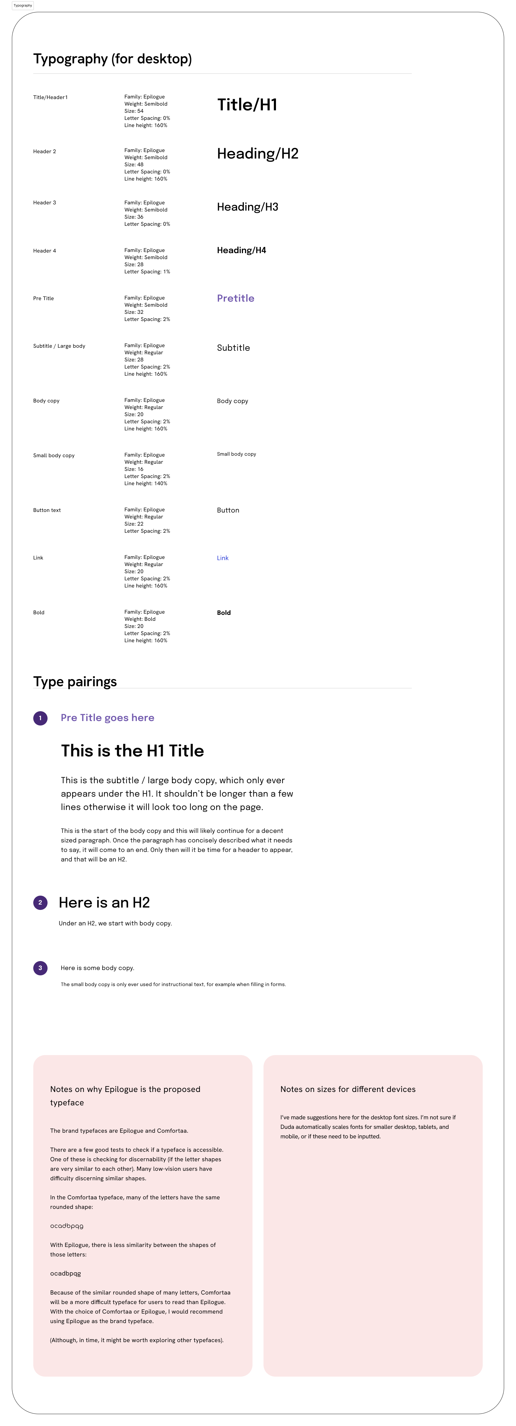
Low-vision users can often have difficulty discerning similar shapes. The brand typefaces are Epilogue and Comfortaa.
In the Comfortaa typeface, the ‘ocadbpqg’ letters all have the same rounded shape. This makes the letters harder to discern, and therefore harder to read.
With the Epilogue typeface, there is less similarity between the shapes of those letters. It’s therefore easier to read than Comfortaa. I recommended using Epilogue as the main typeface.
Line length
A general guide for a readable line length is the alphabet test.
Contrast
A quick check on the WAVE tool showed the original MPP website had 40 contrast errors. The changes suggested in the style guide resolve any contrast issues.
Headings
It’s important to have a consistent heading structure for:
SEO,
screenreaders,
and the scannability of the page.
When I started at My Probate Partner, many of the pages didn’t have a consistent heading structure. Headings would skip from H1 to H3, or use H2 headings for text that wasn’t a heading.
All the pages I worked on now have a clear heading structure.
Style guide
To help implement the formatting changes across the site, I created a mini style guide in Figma. Details included:
font sizes,
colours,
example layouts,
new navigation,
simplified footer,
button options,
and spacing.
All design changes are possible within the limitations of the Duda CMS.
Not all design changes have yet been implemented (but they are on the roadmap).
Style guide sections
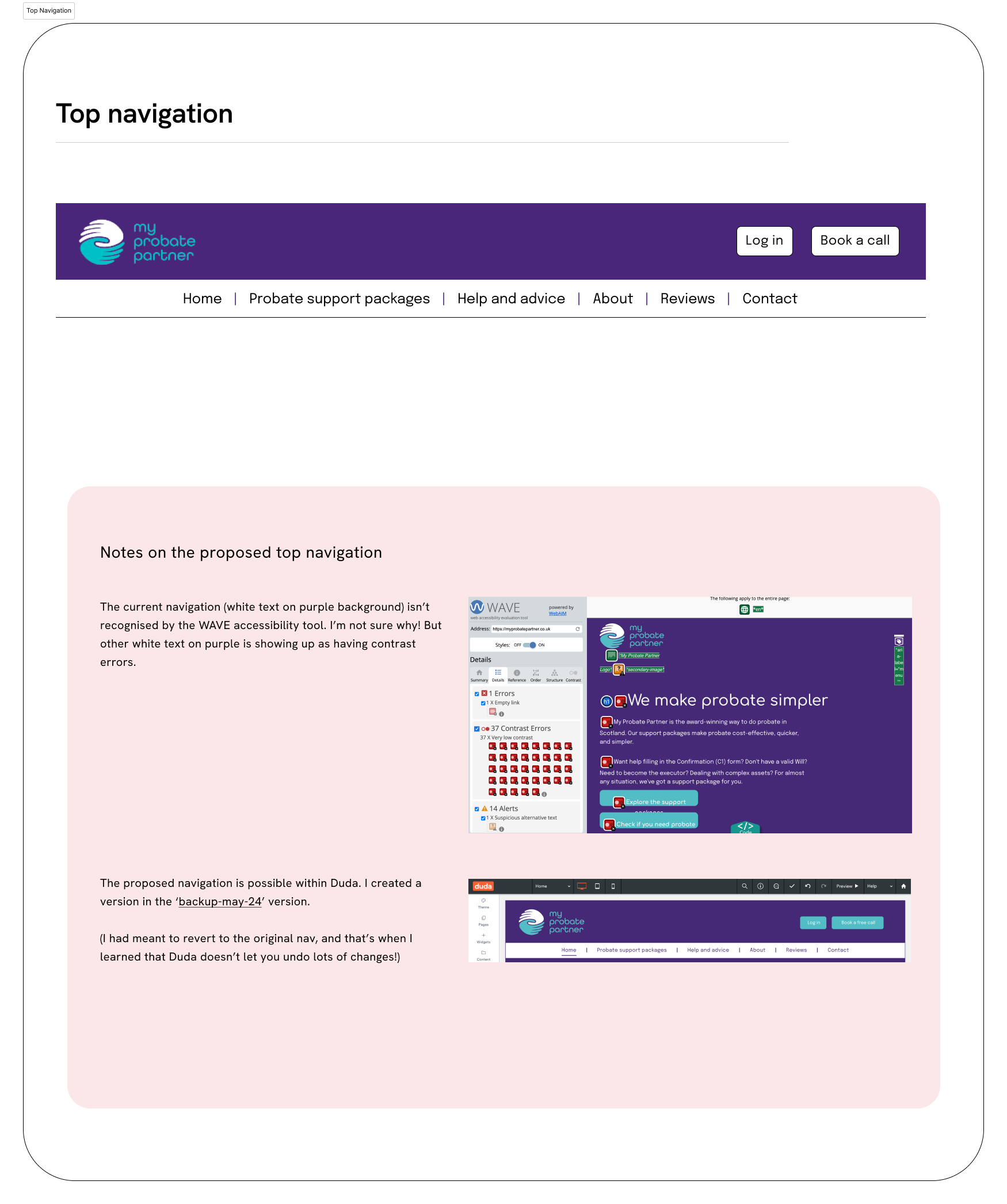
Navigation

Colour swatches
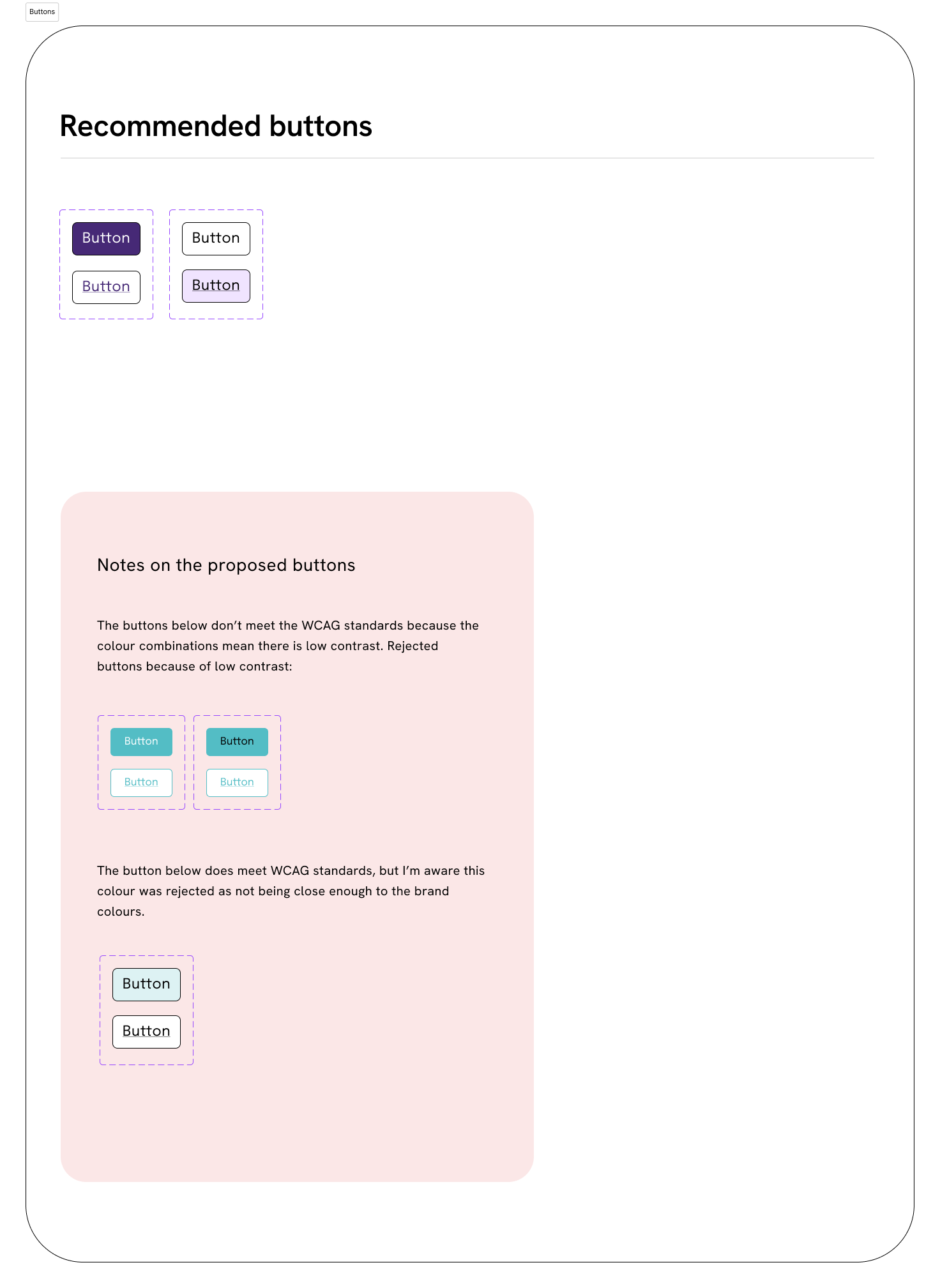
Recommended buttons, with hover state
Typography and type pairings